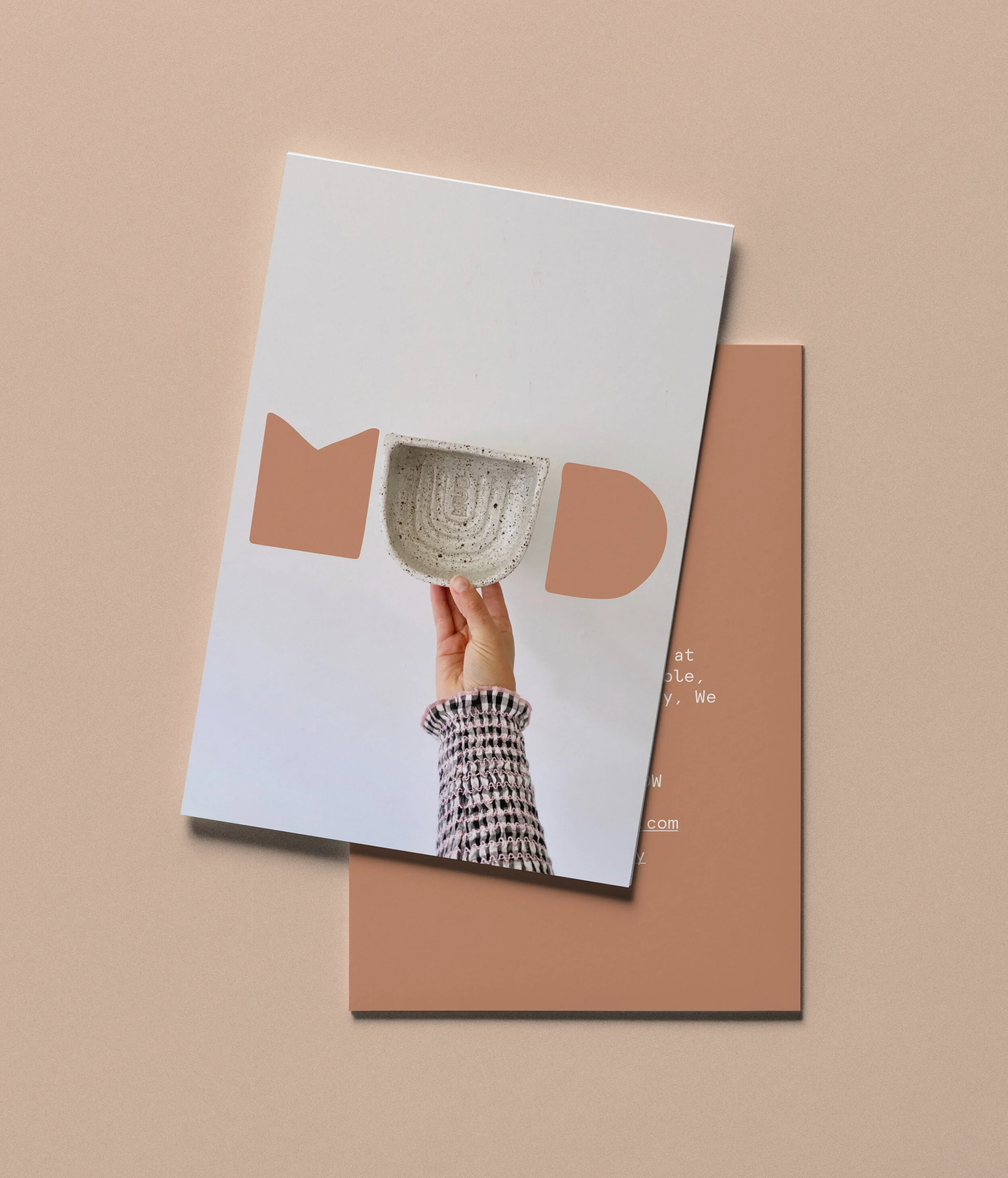
Mud Byron Bay.
— Branding
— Website Design
— Print Collateral
— Packaging
Mud was born out of a need to get back in touch with our kid selves, to play in the mud fully immersed in the sensory experience. Learning presence, letting go, detachment to a desired result and connection with ourselves and those sitting next to us.
Mud offers community-based workshops, small groups, no judgment, big love.
They explore mindfulness meditation through the hand-building method of clay play.
The branding needed to convey a sense of warmth and comfort, movement and fluidity, playfulness, connection and. The rainbow ‘U’ is an upside-down rainbow made from coils of clay, the other letters represent blocks of clay - the starting point of a journey of exploration with Mud.
Photography: Anrielle Hunt


